Why McLaren is suddenly best of rest in F1 - and its chances of staying there
What was behind McLaren's burst at the front of the F1 grid? Project F1 examines how the team's new upgrades are working, and how they combined with other factors to star at Silverstone
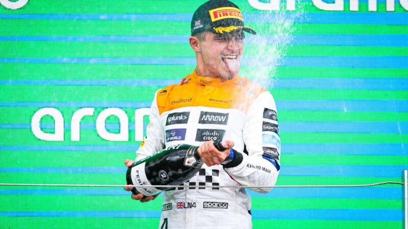
Norris praised his team after finishing second at Silverstone, saying it had done a good job to improve the car
Antonin Vincent / DPPI
Even McLaren seemed surprised at the “rocketship” pace that delivered a podium finish for Lando Norris at the British Grand Prix, and what would likely have been a third place for Oscar Piastri without an unfortunately-timed safety car.
The result comes after a major upgrade in Austria, followed by more enhancements at Silverstone that were aimed at turning around the team’s disappointing start to the season, and which seemed to have delivered beyond expectations. Or did they?
We’ve examined McLaren’s performance from the past two races to identify how it leapt to the front of the Red Bull-chasing pack, and its chances of staying in that position. Using data from practice and the race, we can see how the upgrade affected the car’s performance, but also the other factors at play in the stellar drives from Norris and Piastri at the team’s home race.
Austrian Race Weekend
McLaren upgrades boosted Norris in Austria
Chart 1 Norris vs Piastri comparison
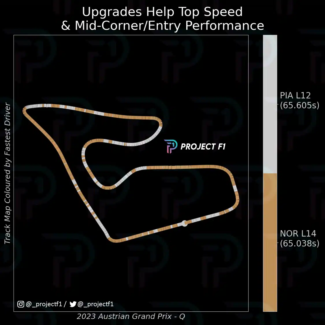
McLaren brought a major upgrade to the Austrian Grand Prix, fitting Norris’s car with a new floor and modified sidepods, a reshaped engine cover and altered fairings for the halo and mirrors.
Crucially, it only had enough parts for a single car, so Piastri stuck with the old spec, making the race a handy comparison between both versions.
Chart 1 compares the qualifying performances between Norris and Piastri during Q2. Orange shaded areas indicate sections of the track where Norris is faster while white shaded areas indicate where Piastri is faster. While majority of the track is in favour of Norris, it is notable that Piastri is only faster under acceleration in the traction zones. It’s most obvious in the slower corners, Turn 1, Turn 3 and Turn 4. Norris is faster on the straights and the higher speed corners – a positive sign ahead of the race in Silverstone.
Austrian GP qualifying: Norris and his closest challengers
Chart 2 Norris vs Hamilton and Stroll
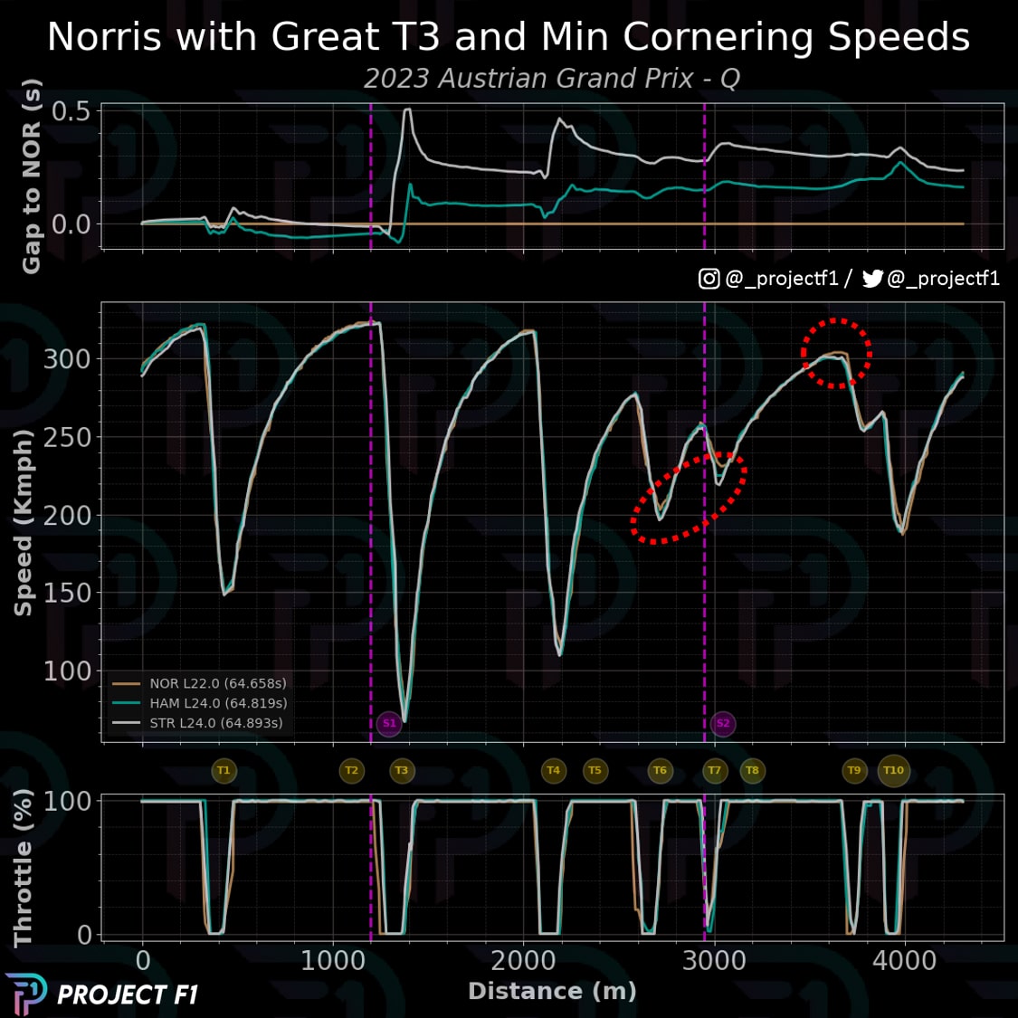
The effect of Norris’s upgrade in Austria can be seen in his pace against others in the midfield. Chart 2 visualises the telemetry traces of the McLaren driver, Lewis Hamilton and Lance Stroll during their best runs for Q3. Norris qualifies ahead of the other two by almost two-tenths, with the first pane showing the profile of the delta across the lap.
The second pane showcases the speed trace, with key moments circled in red. These show parts of the track where Norris had higher minimum cornering speeds compared to Hamilton and Stroll. These occurred in Turn 6 and the run through Turns 7 and 8 with another moment at Turn 9. These account for all the high-speed corners at the circuit.
Norris’s edge over Hamilton
Chart 3 Trend Race Pace Compared
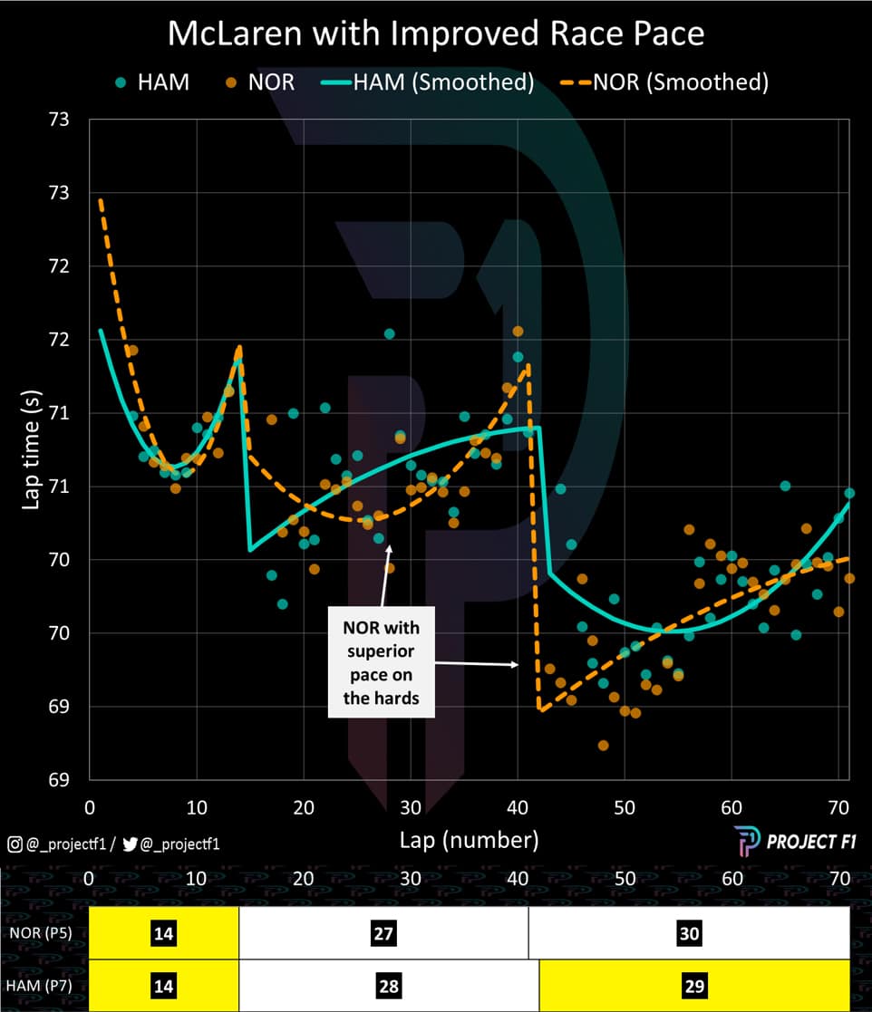
Qualifying had showed the gains of the upgrades over a single lap. But how about over several? Chart 3 above compares the race pace trend between Norris and Hamilton. The performance differential was tight in the first stint on mediums but Norris opens up his advantage while on the hard tyre — which would prove significant at Silverstone a week later. This pace continues into the final stint, even when Hamilton is on the mediums.
Hamilton also committed several track limit violations at the Austrian Grand Prix while Norris was able to avoid such a fate. Most of Hamilton’s infringements were occurring in the fast Turns 9 and 10 as he was defending against Norris, suggesting that the McLaren was formidable in this section.
British Race Weekend
How fast corners suited McLaren
Chart 4 Norris vs Leclerc and Russell
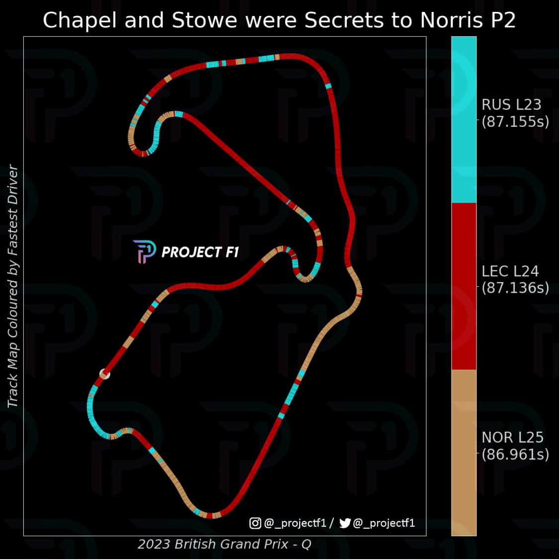
A week later, the factory autoclaves had produced another set of updated bodywork for Piastri’s car, but Norris’s was upgraded further with a new front wing and revised brake ducts. Lo and behold, McLaren took the second and third spots on the grid
Chart 4 above breaks down who was fastest in the different areas of the circuit between Norris, Charles Leclerc and George Russell. Once again, the McLaren excels in the higher speed corners, particularly Chapel and Stowe. Ferrari is super-fast in the straights while Mercedes has some performance in the slower speed corners.
This observation builds on those seen in Austria but with greater effect since there are a greater collection of high-speed corners at Silverstone compared to the Red Bull Ring. Aerodynamic efficiency plays a more important role at this circuit.
McLaren on a roll… until the safety car
Chart 5 British GP cumulative delta
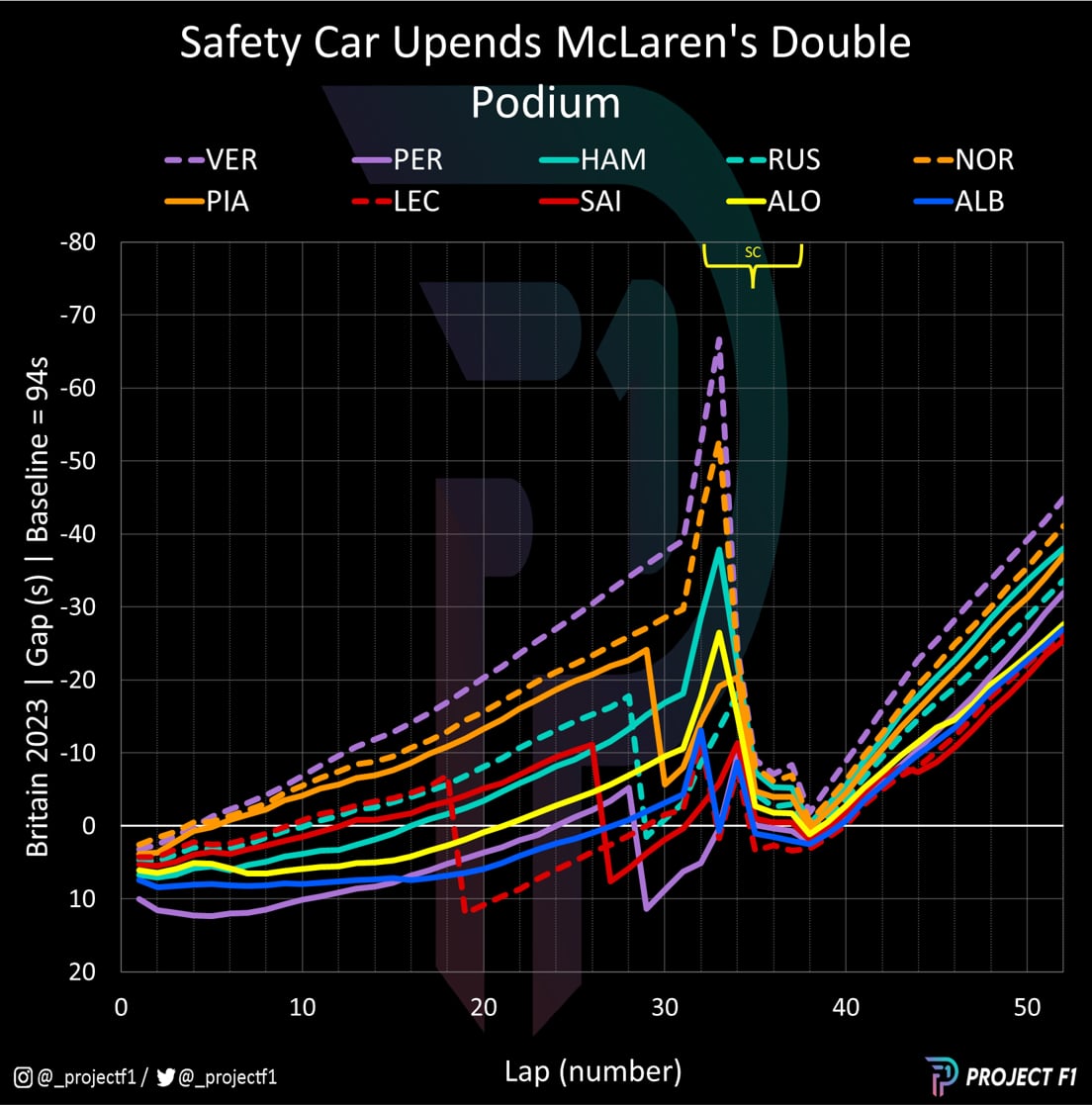
A grand prix and a half’s worth of momentum led up to this – Sunday’s race. As the lights go out, Norris and Piastri have blistering starts against Verstappen. Both drivers mount a challenge with Norris muscling his way into the lead of the race. It’s an impressive showing, especially in a season with such a dominant driver and car combination while going some way in highlighting McLaren’s recent ascendency.
With a sense of inevitability, Norris concedes the lead of the race, but his and Piastri’s ability to gap the rest of the field comes as a much greater surprise.
Chart 4 is a cumulative delta, plotting each driver’s average lap time, updated for every lap of the race, and set against an average 1min 34sec lap. From lap 4 onwards it shows both Norris and Piastri running closer to Verstappen than they do to Leclerc in fourth. This gap continues to grow until both Leclerc and Russell pit.
With Russell out of the way and sufficient field spread down to Alex Albon, McLaren could pit Piastri onto the hard tyre, leaving him only a slower Fernando Alonso in close proximity ahead. The tactics were sound and Piastri was making quick progress before Kevin Magnussen’s car conked out, forcing the deployment of first the virtual safety car and quickly followed by the full course caution.
Piastri loses out in the pits
Chart 6 Net gain/loss from strategy
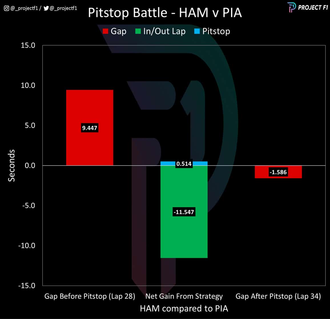
The safety car was a gift for the likes of Hamilton who was able to perform his mandatory pitstop under safety car conditions and gain an almost 12-second advantage on the unfortunate Piastri as shown in Chart 5 above.
McLaren suddenly looked on the back foot, as Hamilton had pitted onto a set of used soft tyres while Norris – who had also received the benefit of the safety car — had pitted for a set of fresh hards.
This was a peculiar choice given the few laps remaining in the race, as well as the evidence from Russell that the soft tyre could last 28 laps – and on a heavier fuel load. So why did the McLaren pitwall take this strategic route?
How hard tyres were McLaren’s secret weapon
Chart 7 Free Practice 2 race simulations
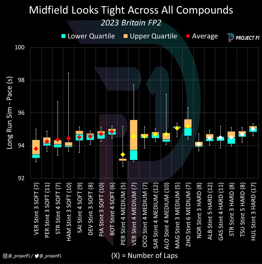
One reason for McLaren’s tyre choice came down to what fresh sets of tyres were left. Norris only had a fresh set of hards and no new sets of softs available.
The other reason comes down to expected performance across the different tyre compounds. Chart 7 above showcases the data from the race simulations in FP2, showing the range of lap times from each set; the mid-range times shown in the orange and blue clusters.
The chart highlights that McLaren had the best representative pace on the hard tyre compared to peers while placing 2nd last in performance on the soft tyre. And while there are plenty of variables involved in practice sessions, this was an observation that built on the in-race information that came from Austria from Chart 3 earlier.
In essence there were some compelling data points that combined with the tyre availability had supported the case for a gamble on the hards following the safety car restart.
McLaren’s pace over Mercedes
Chart 8 Trend race pace compared
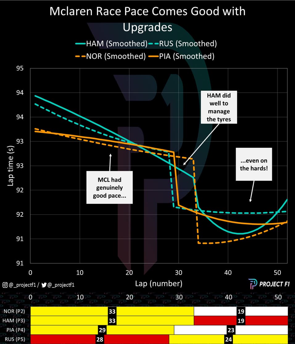
So how did everything transpire? Chart 8 shows the race pace between Norris and Hamilton – and why there was such a fierce battle with both drivers pushing significantly towards the end of the race. However, Hamilton overheats his tyres and has to drop the pace, losing time to Piastri who had been eking out the performance for a late-stage push while defending against Russell who was on the mediums.
In the end, McLaren had enough pace in hand to maintain position and hold off the Mercedes threat. Even though it lost out on a double podium due to the timing of the safety car, it was a stellar performance by Norris and Piastri alike – both showcasing their talent and grit under tough circumstances – particularly for the Australian rookie.
Beyond Silverstone: what to expect in Hungary and Belgium?
Austria and Britain offered huge validations of McLaren’s gains, but can the team continue to race at the front? McLaren has certainly taken a step forward in car performance, reflected in both the data and driver confidence. However its pace in fast corners won’t prove such an advantage in all of the races ahead.
Hungary is next and is more akin to Monaco without the walls, albeit with more high-speed corners. Lap time depends little on out-and-out top speed, so placing more emphasis on raw downforce as opposed to aerodynamic efficiency, where McLaren has recently proved strong. It could be a good test to see how the car handles in this regard.
Belgium, on the other hand, is more akin to the characteristics seen in Silverstone – with a focus on efficiency by balancing top speed with high speed cornering. McLaren should look good in this regard based on what we’ve seen – but Ferrari will still remain a threat (given the importance of power may still have the edge over cornering).
In any case, the racing behind Max Verstappen continues to be some of the best we’ve seen yet. Let’s hope to a few more nail-biters as we approach mid-season.
Project F1 turns data into graphics that uncover race pace and strategy
See more analysis at @_ProjectF1 on Twitter or @_ProjectF1 on Instagram
