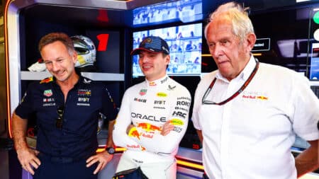
How real are Red Bull's concerns that Verstappen could leave early?
Helmut Marko caused a stir after the Bahrain GP with his worries that Max Verstappen could leave Red Bull early. But how real are those fears?
Don’t believe the hype: racing cars look good this season. You just need to know where to look…
When IndyCar released its new universal aerokit for use from 2018, there was a sigh of relief from drivers and teams alike. The Dallara-built spec chassis reduces costs and should keep teams on a level playing field, at the same time reducing the turbulence coming off the rear wing of the car and improving the racing. That same issue hindered Formula 1 drivers’ efforts to overtake in 2017.
American broadcaster NBC reported a 3 per cent increase in IndyCar viewership from 2016, and an equal rise in streaming viewership – though the figures barely make a dent on ESPN’s numbers, according to Sports Media Watch. You can safely glean that IndyCar is on the rise, and this new aerokit could well prove a catalyst for more people wanting to watch big names racing close, fast single-seaters.
On a purely primal level, the aerokit hits home. Starting with its swept-back wing, conveying a real sense of attitude, the Indycar is punchy from the get-go. There’s no ridiculous rear diffuser, either; nothing convoluted or tacked-on. The theme continues with the subtle fin on the engine cover, which leads seamlessly up to the roll hoop and the lines follow all the way up to the front wing.
And what a front wing that is. It’s relatively simple in front-wing terms – nothing like the vented and furiously sculpted F1 offerings that change from race to race; wide, flat, and just functional enough.
The whole package is a salivating prospect, the kind of car I would doodle while absent-mindedly sitting through lessons at school.
There’s a caveat, however, and that’s the inclusion of a head-protection device for 2019. A reaction to the death of Justin Wilson at Pocono in 2015, the head-protection device has become necessary, and whether or not you agree, it’s here to stay.
The use of this windscreen, which is made from the same material as an F-16 fighter jet’s canopy, is inarguable if its safety credentials can be proven in further tests. Yet, aesthetically speaking, IndyCar has again got it right.
In IMSA sports cars, the Daytona Prototype international cars also look striking, and they actually resemble their road-going versions – Simon Pagenaud rightly called his Team Penske Acura “beautiful.”
Elsewhere, the new WTCR series features wide-bodied Hyundai, Audi and Volkswagen machines that give off more than a hint of the 1980s Japanese Super silhouette racing cars, which themselves inspired a wave of Japanese tuners to do the same to their road cars.
NASCAR seems to have made a step forward too, specifically Chevrolet with the new mean-mugging Camaro ZL1-bodied stock car, while the latest generation of GT racers, such as the new Bentley Continental GT3, the upcoming Aston Martin Vantage GTE and the Mercedes-AMG GT3, all look imposing, without losing the character of their road-going variants.
The jury is still out on Formula E’s new bold, batmobile-inspired design, but the series hasn’t made many wrong moves yet and it’s hard to see the series’ momentum waning in the future. Importantly, its implementation of the halo is the best seen yet and the new LEDs are a welcome addition.
And where does that leave the halo-laden F1 for 2018?
Many a Motor Sport commenter is dreading the halo, but we’re forgetting that it won’t be a jarring black appendage when the season starts. Rather, teams will attempt to incorporate it into their new liveries.
But there lies another problem.
The 2017 batch of liveries was unremarkable at best, with Force India’s first attempt (before the pink re-do) drawing scorn from those who – perhaps rightly – lambasted its overbearing sponsorship stickering. It made NASCAR stock cars look subtle. Luckily, it was ditched for the BWT livery, but that was still a confusing mess of lines.
People with design credentials agree on that. Mention of it to Paolo D’Alessio, the man who designed the livery for the 1990s Martini-decked Lancia Deltas, and he appears insulted by it. Haas, McLaren and Sauber were brought up in the same vein.
So might it be that it’s not the halo that’s ruining the look of the new, wider, F1 cars, but the lack of distinctive liveries? Let’s just hope that, when Williams releases its new car on Thursday, it doesn’t mess with tried and tested Martini stripes, and Toro Rosso’s new Honda partnership doesn’t ruin what was a better example of a 2017 paintjob.
Force India, which will be renamed soon, could well pull it back in the livery department as it looks to improve its viability to potential sponsors, and McLaren has teased another orange car and promised papaya. But you wouldn’t bet against Mercedes remaining grey.
Haas already revealed its new livery on Wednesday, with the statement reading: “Its look is clean and precise, just like the machine tools made by Haas Automation.” Now we’ve seen the halo, albeit in a render of a 2018 car, it doesn’t look so jarring – but the black appendage on a black background may be masking its true appearance.
Liveries make a huge difference when it comes to the visual qualities of racing cars, and that’s part of the reason that we’re all cringing at the addition of the halo. If F1 teams get that right, it could win over those who have fallen out of love with the motor sport.

Helmut Marko caused a stir after the Bahrain GP with his worries that Max Verstappen could leave Red Bull early. But how real are those fears?
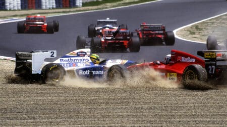
Ayrton Senna’s tragic final races in 1994, marked by controversy over illegal traction control and his relentless pursuit of excellence in a challenging car, remain a poignant chapter in F1 history, as Matt Bishop recalls
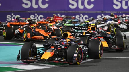
Full F1 schedule for the year, including the next F1 race of 2025: the Saudi Arabian Grand Prix, the whole calendar and circuit guides for the 24-race Formula 1 season
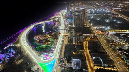
Round five of the 2025 Formula 1 season wraps up the first triple-header of the year in Saudi Arabia. There are the dates and start time for the Jeddah event, including all sessions