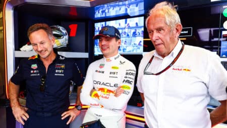
How real are Red Bull's concerns that Verstappen could leave early?
Helmut Marko caused a stir after the Bahrain GP with his worries that Max Verstappen could leave Red Bull early. But how real are those fears?
There have been numerous instances of Formula 1 chopping off its nose to spite its face. This week, however, was a first: appending a nose to the same effect.
Although the aerodynamic changes new for 2014 are small beer compared to those demanded of other parts of the package, they are all we’re talking about.
Yes, form follows function in the binary chase of the last nth, but a line – preferably a pleasing one – must be drawn when a new batch of F1 cars, rather than provide a frisson and surge of pride, makes the sport a laughing stock.
That’s now.
Even their doting designers can’t love this latest lot.
The Ferrari looks like an unfortunate bottom-feeder normally only viewed through the bubbled window of a Jacques Cousteau-type bathyscaphe. The Toro Rosso’s unfortunately shaped protuberance caused Ann Summers to tweet with, ahem, tongue firmly in cheek. And, most hideous of them all, is the Caterham’s Lego-like Hoover attachment.
A ‘vanity panel’ big enough to cover their shame does not exist.
The background to this is the praiseworthy aim of improving safety: lowering the nose’s tip by 365mm in a bid to prevent cars being launched in an accident. And be of no doubt, too, that teams have spent hundreds upon hundreds of hours arriving at the best solution in terms of performance.
It is astounding, however, that the situation has been allowed to turn so damn ugly.
And you thought last year’s noses were a step too far.
Adrian Newey, who draws his cars full-scale and habitually sketches in a paper pad with – cue appreciative nod to the Russian space programme – a pencil, once told me that, should two parts emerge from the wind tunnel having generated the same result, he would select the more handsome.
No surprise, therefore, that Red Bull’s 2014 offering is easier on the eye. ‘If it looks right, it is right’ is an unquantifiable old saw, but thank God that the best designer in the paddock sees no reason to butcher it.
McLaren, another team with an eye for the aesthetic – style doesn’t come cheap, clearly – has also managed a pretty good makeover. So, too, has Mercedes-Benz, although the wing failure that pitched Lewis Hamilton into a tyre wall on the opening day of testing at Jerez was unfortunately timed for the sport as well as, the mercifully unhurt, driver.
That Lotus, meanwhile, is already having to argue that its twin-tusk – dolphin, platypus, whatever! – is legal, causes the heart of this fan to sink even further.
It’s time to hit F1 with the pretty stick. A better(-looking) solution cannot be beyond the wit of its combined computer-, brain- and spending power. Unlike 1971, there can be no excuse.
Back then, aerodynamics and computing were in their infancy. Even the brightest of minds relied on tufts of wool, wetted fingers in the air and instinct. Thus we had the Lobster Claw, the Tea Tray and, in Mauro Forghieri’s fecund mind at least, the Snowplough. Though they sound like dance crazes, they were nicknames for the noses of F1 cars.

Two nose configurations for Stewart’s Tyrrell in 1971
The debate raging was this: sharp-edged wing/s (mounted quite high in some cases) or bulbous and low? That Jackie Stewart’s Tyrrell 003 won in both guises that season suggests that there wasn’t much to choose between them, symptomatic perhaps of the relatively small loads generated.
Two teams, however, adopted very different stances. They proved ‘pretty’ effective.
Brabham designer Ron Tauranac, a visitor to MIRA’s wind tunnel from the early 1960s on, fitted his BT34 with radiators ahead of each front wheel, and spanned the resultant gap with a large adjustable spoiler over a snubbed nose. Veteran Graham Hill used it to set fastest lap at the Race of Champions and win the International Trophy before his season descended into disgruntled disappointment.
Carlos Reutemann’s grabbing of pole position for his world championship GP debut at Buenos Aires in 1972 – imagine the cheers! – plus his win in the subsequent non-championship Brazilian GP clawed back respect for the concept: an aerodynamic device shielded from air unsettled by the rotation of the front wheels. The split-radiator idea possessed sufficient merit for Tauranac’s successor Gordon Murray to stick with it – and win with it – for several more seasons.

Graham Hill in the ‘Lobster Claw’ Brabham BT34
March, meanwhile, turned to the man who had during the late 1950s introduced scientific aerodynamics to F1. Frank Costin’s priority for his Spitfire-shaped front wing – the size of a tea tray and perched atop a ‘unicorn’ mounting – was a reduction in drag. That this high-mounted item was in clean air, however, allowed it to generate more downforce than its shallow profile and angle of attack suggested it might.
Had it not been for 003 and JYS, 711 would have been the car to beat. Its unusual outline caught the eye, but the packaging solutions it forced upon the team played as large a part in the car’s success. It was Robin Herd’s – with assistance from ex-Lotus man Geoff Ferris – best F1 design for March.
It helped, too, that Ronnie Peterson could make anything go quickly – excepting Herd’s disastrous 721X of the following year.
The consensus at that time was to harness the air passing over the car’s bodywork: hence the Lotus 72’s wedge shape. The arrival of ‘wing cars’ and ground effects at the decade’s end turned that on its head.

March’s 711 was fast in the hands of Ronnie Peterson
Though the governing body responded by raising skirts before removing them altogether, and smoothing bottoms before caning the teams with a long, thin piece of wood – are you reading, Miss Summers? – the laws of physics could never be entirely restrained.
In 1990, Tyrrell’s Harvey Postlethwaite and Jean-Claude Migeot introduced the raised anhedral nose, the idea being to channel air underneath the car while maintaining its front wing’s optimal position close to the track’s surface. Upon its launch, McLaren’s Ron Dennis remarked that, if it worked, it would cost the other teams a great deal of money in terms of retooling, etc.
It worked very well given the relative lack of power of the 019’s Cosworth V8, but not well enough to cause a stampede. Only when Benetton cocked its snook to convention and began to meet increasing success with its version during the early 1990s did the concept take firm hold.
The troubled Williams FW16 of 1994 was the last low-nosed car to win a GP. Rather like Colin Chapman’s delayed conversion to the benefits of putting the engine behind the driver, the high nose was Newey’s blind spot – caused to some extent, I like to think, by aesthetic considerations.
Though having barely blinked since, he still strongly believes that winning doesn’t automatically make a racing car beautiful. 2014 is about to conclusively prove him correct.
That he doubts, too, whether these clownish, ahem, hooters will improve safety surely means that the nays – not the eyes – have it on this occasion.
The new turbo V6 powertrains – they sound great and should be more fun to drive – are what we should be talking about: torque.
That we are not is sad.
Sniff.
More from Paul Fearnley
Grand Prix drivers in the Monte Carlo Rally
Mini’s Monte Carlo anniversary
Timmy Mayer: McLaren’s lost talent

Helmut Marko caused a stir after the Bahrain GP with his worries that Max Verstappen could leave Red Bull early. But how real are those fears?

Ayrton Senna’s tragic final races in 1994, marked by controversy over illegal traction control and his relentless pursuit of excellence in a challenging car, remain a poignant chapter in F1 history, as Matt Bishop recalls

Full F1 schedule for the year, including the next F1 race of 2025: the Saudi Arabian Grand Prix, the whole calendar and circuit guides for the 24-race Formula 1 season

Round five of the 2025 Formula 1 season wraps up the first triple-header of the year in Saudi Arabia. There are the dates and start time for the Jeddah event, including all sessions