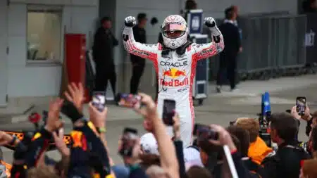
F1 snore-fest shows new cars badly needed: Up/Down Japanese GP
The 2025 Japanese GP showed a much more extreme change than next year's technical regulations is needed to make racing at classic F1 tracks interesting
Not all progress is in the right direction. We have watched for years as cars have grown heavier and less responsive and have required ever more powerful engines just to make them move at the same rate as their predecessors while ignoring the price still to be paid in handling precision, fuel and material consumption. Cars are less space efficient than ever, harder to see out of and keener than ever to tell you, their allegedly free-thinking, independent owner how you should or should not be driving.
But the lost talent I miss most often, if not actually most, seems so simple, so easily recaptured at times I wonder why it went at all, let alone why no-one appears interested in re-inventing it. Yet when you look at how we actually use our cars, it is one of the most important aspects of car design there is. I talk of the death of decent dashboard design.
There’s an entire thesis in the evolution of information presentation over the near 130 year history of the car. In the early days instruments spread randomly and illegibly across dashboards like a pox. The odd dial here and there, increasing in prevalence as time wore on and according to cost until you arrive in around 1930 and look at the dashboard of, say, a 4.5-litre supercharged Bentley which was far more complex than that of a light aircraft of the same era.
It was only after the war that designers started to accept that simply providing the information was of only limited value if it was not done so in a way that allowed said information to be imparted without the driver taking his or her eyes off the road for lengthy periods of time simply to locate the relevant dial.
The golden era started in the 1960s. Look at the facia of a Jaguar E-type and tell me, really, how information could be communicated with greater elegance or ease? Porsche rightly drew gales of criticism for pebble-dashing switches, buttons and levers all over the interior of the 911; but the dials themselves with the rev-counter presented front and centre in a position of hierarchical superiority provided a template that has rarely, if ever, been improved upon. And certainly not by Porsche.
I think BMW probably hit the peak in the 1970s. If genius really is simplicity then the instrument pack of even a base E21-era 3-series is worthy of Einstein. You just can’t communicate more clearly than that. To me it is art, pure and simple and an art that has been all but lost.
Look at the Porsche 911 today. The rev-counter is still where it should be, but the speedometer has now become so cluttered Porsche has to provide a second, ugly, digital speed readout just so you know how fast you’re travelling. Aston Martin is even worse: its instruments have been unreadable for a decade and with its supplementary speedo, it too has tacitly admitted an entirely self-inflicted defeat.
Today instruments (or Instrument Packs or ‘IPs’ as the industry bloodlessly calls them) have lost not only their elegance and beauty but much of their ability to do the job for which they were designed in the first place. Ugly analogue dials compete with uglier digital displays under the same cowling, neither really deserving of your attention or aware of the fact that when you drive your car, the instruments are what you spend more time looking at than anything else.
And all this despite the fact that there are fewer instruments than cars have had for 100 years. My old Peugeot 205GTI has an oil pressure gauge and an oil temperature gauge to go with the more normal water and fuel displays too. Now even a water temperature gauge has become an increasingly endangered species.
I know why – cars don’t tend to boil over these days and if they do a simple light will suffice – but this misses the point that the dashboard is a vital interface between car and driver, an under-rated yet critical component of the very character of a car.
Even the rev-counter’s days appear numbered, being increasingly replaced by ‘power reserve meters’. I thought this dial had a certain elegance and relevance when I first saw it in a Rolls Phantom 10 years ago, but in mass-market tin boxes it is an irrelevant gimmick.
All I want is for a set of simple dials, all carrying the same uncluttered typeface to tell me not just what I need to know about the condition of my car, but what I’d like to know too. We could do it 50 years ago. Why not now?
More on road cars
Get Norman Dewis a knighthood
How to save fuel
Are car journalists ‘bought’?
Honda is back

The 2025 Japanese GP showed a much more extreme change than next year's technical regulations is needed to make racing at classic F1 tracks interesting

Max Verstappen looks set to be pitched into a hectic, high-stakes battle for F1 victories in 2025, between at least four teams. How will fans react if he resorts to his trademark strongman tactics?

Red Bull has a new team-mate for Max Verstappen in 2025 – punchy F1 firebrand Liam Lawson could finally be the raw racer it needs in the second seat

The 2024 F1 season was one of the wildest every seen, for on-track action and behind-the-scenes intrigue – James Elson predicts how 2025 could go even further