The master of F1 car liveries: Peter Stevens
The hues of an F1 racing car have a single job – to instantly grab your attention. Damien Smith speaks to the master of liveries Peter Stevens about his designs for Brabham, RAM and Williams and which of today’s schemes delight or depress
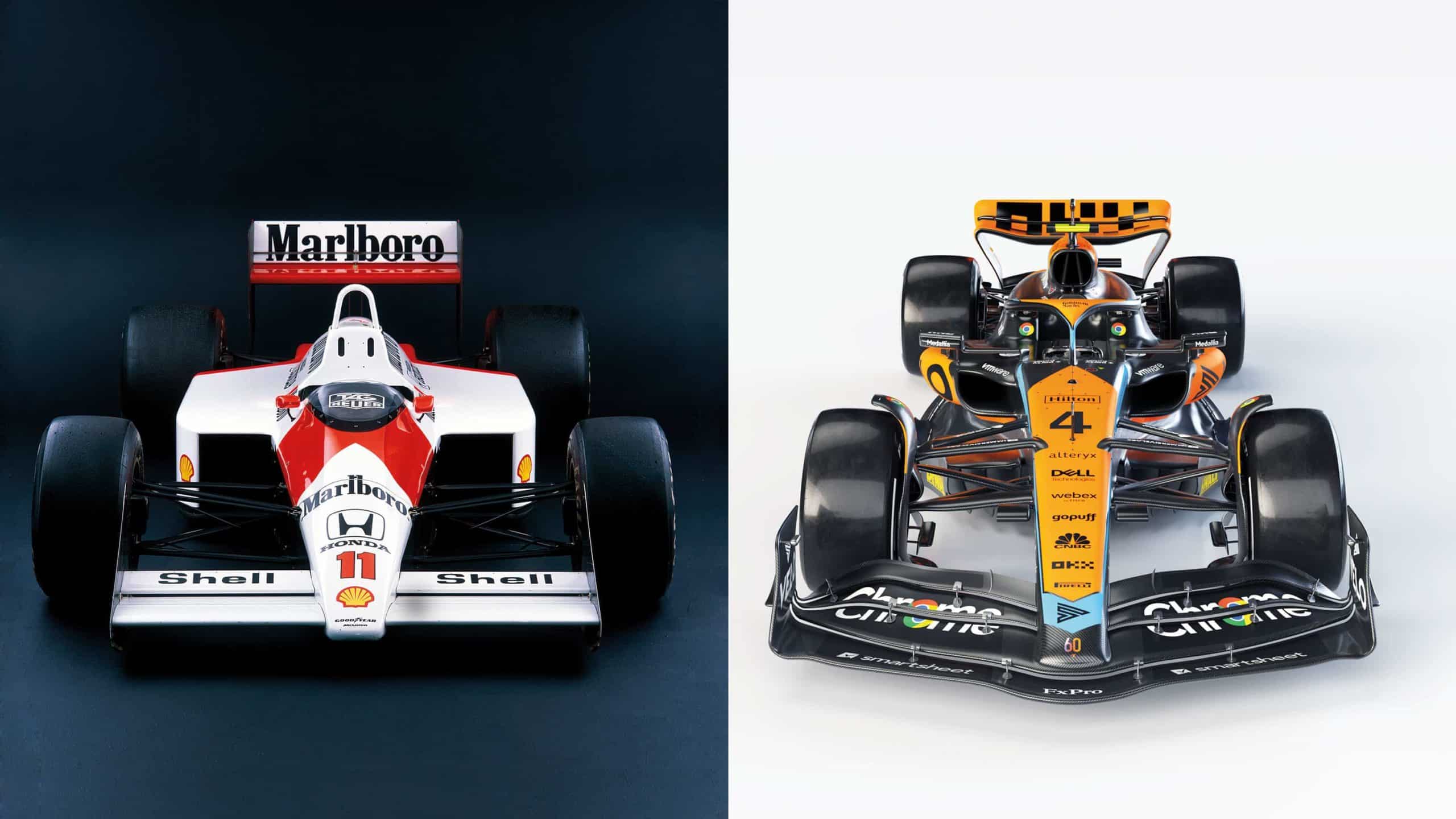
Heritage Images/Getty Images, mclaren
Are racing car liveries as cool and memorable as they used to be? Let’s ask a man who should know. The trouble is, any conversation with Peter Stevens, the eminent designer behind some of the best, can never be linear or simple – which is kind of ironic given how ‘simple’ is a recurring theme that we keep looping back to.
A chat with Stevens is always colourful and you never quite know where he’ll go next. He’ll divert to tell you what he thinks of the new generation of LMDh/GTP sports cars at Daytona. Or how Frank Williams admitted to him that the late 1990s Winfield tobacco livery was a mess (but didn’t really care). Or how he once discovered Flavio Briatore’s ‘secret apartment’ when he leaned against a fake bookcase in the flamboyant Italian’s old Benetton office.
But amid a thoroughly enjoyable 40 minutes of entertaining and enlightening snippets, a pattern does emerge from the collage: yes, Stevens does still spot design that appeals. But there’s probably less of it than there used to be, largely because of modern corporate interference replacing an individual vision. Then again, even the best-presented proponents misfired on looks on occasion – including the man credited with the commercialisation of the F1 car.
“Most young people look at Formula 1 on a phone or pad”
“Colin Chapman was exposed to the Indy 500 and saw how it ran totally on sponsorship,” says Stevens. “He realised that could be transferred to F1 in his stylish way, and that led to the John Player Special era. But gold was a disaster, which is why the gold bits actually became cream – even though they still looked gold on the telly, which was quite interesting. But later when he went to Essex Petroleum, they insisted on this shiny sort of silver and mostly you couldn’t read it at all.” Although we’d humbly suggest the Essex look was far from a dud – even if the Lotuses sheathed in its blue, red and chrome were precisely that.
Anyway… see what’s happened there? We’ve been diverted. Already! Let’s pull Peter back to his first principles of good design, then find out where he sees it in action today in F1.
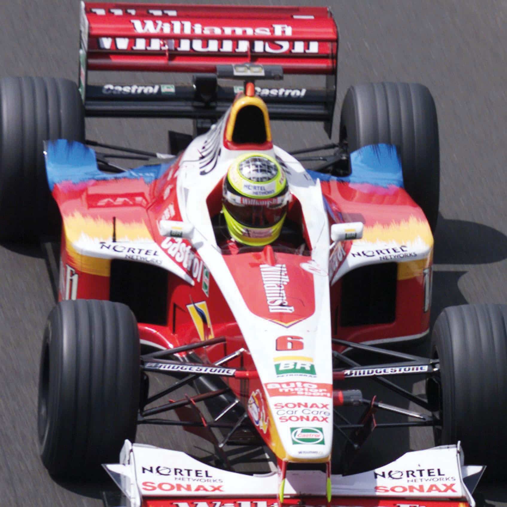
Colour-splash Williams, 1999 – disliked by Frank
Getty Images

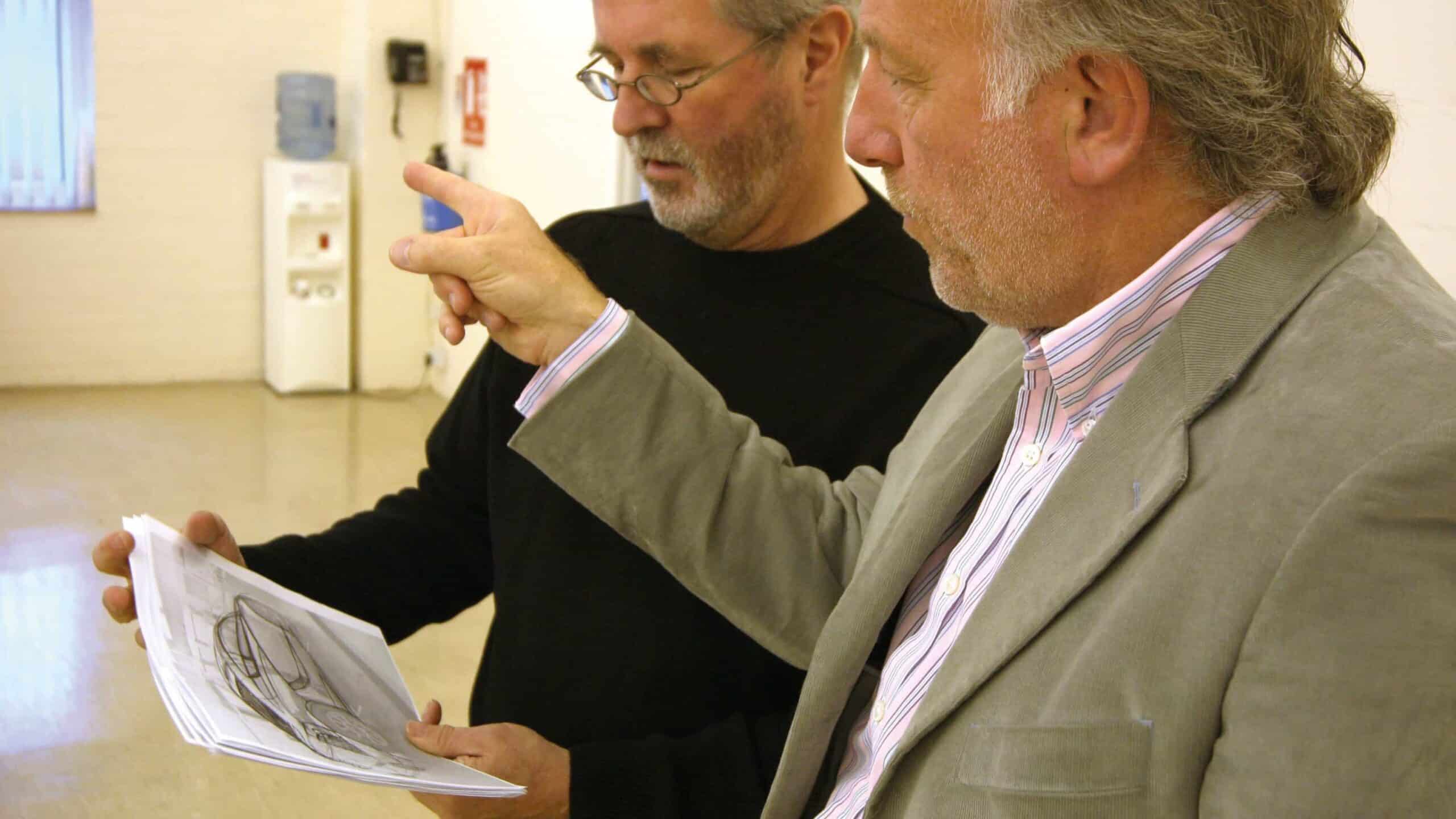
Peter Stevens’ going off on a tangent
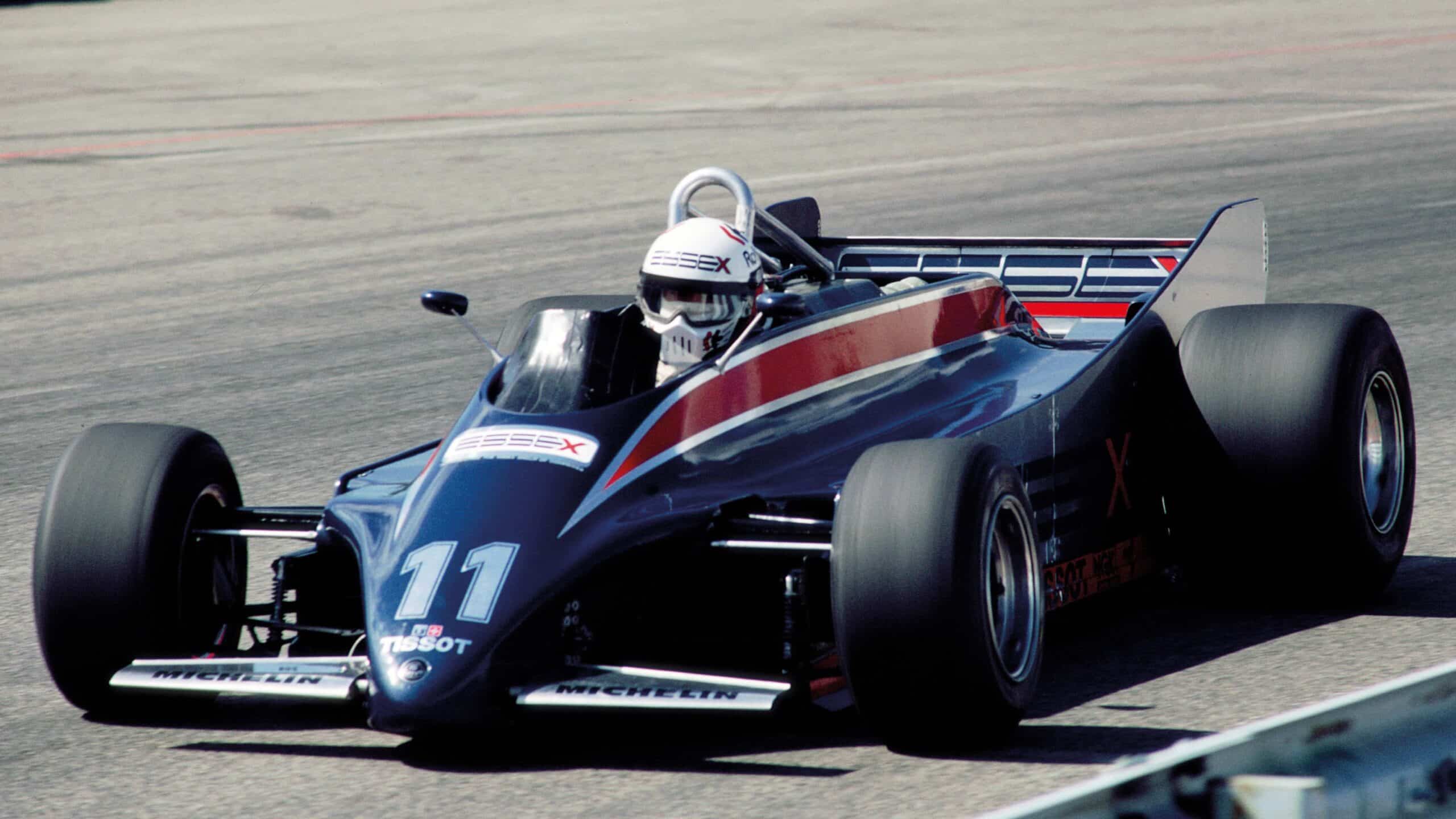
Essex livery – better than the Lotus 88?
Getty Images
Immediately we’re struck by why he remains so revered for his varied contributions to the car world over a career spanning more than 40 years, and why Formula 1 asked him for his opinion when the new generation of grand prix car was in its gestation. “I talked with the Liberty [Media] people when they were looking at what the new rules would be, and I said most young people that you’re trying to attract look at F1 on a phone or pad, and on those devices you can’t see a 27-piece front wing. It’s a waste of time and money.”
So here’s that recurring theme: Stevens always aims to keep it simple and doesn’t lose sight of his purpose – whether he’s designing the epochal McLaren F1, the little Citroën-based city car he’s currently working on or coming up with some of the most memorable racing car liveries that have ever graced the track. Bernie Ecclestone’s beautifully presented blue and white Brabhams are his most familiar signature, yet they were a product of expediency.
“When I started in design, the world was in black and white in terms of television,” he says. “Actually I bought myself a little black and white television to see how things looked. I did a scheme for John Macdonald in red and white for Wella hair products and it didn’t show up on black and white TV at all. It was a complete disaster. Whereas black and yellow or dark blue and white did, which was one of the reasons that we did the Brabhams in those colours.
“Remember, you just get a fleeting image. Even now, it’s a very quick look at an image that goes past that needs to fix in your mind. The straightforward thing which I remember saying to Bernie is that the people who are giving you millions of pounds are doing so because it’s a high-profile, high-visibility sport that they want to be involved with, and also they want to have that kind of quality. That’s what they bought into.”
“It’s a very quick look at an image that needs to fix in your mind”
In other words, presentation matters – no matter what Frank Williams used to say. “The principle is terribly simple: try not to make the car look horrible.” It sounds obvious, but… “I’m not sure that people do any of that thinking now, at all.”
So come on, F1 today: which teams are getting it right, Peter? The man who came up with the Canon livery on Richard Lloyd’s pristine Porsche 956 – among the best of a celebrated bunch, on the ultimate customer racing car – pinpoints a clear top three. “Alfa Romeo,” he says. “You can tell what it is by the nice, dark metallic red, a simple scheme. There’s no doubt in your mind what it is. The message that goes from the eyes to your brain is that you’re looking at an Alfa Romeo, which is what the whole thing’s about, really.”
Who else? “Red Bull do it very well. The fact that you can’t miss it. It happens that the red, yellow and dark blue work very well. Yellow has always been good, which is why Renault used it. In the 1970s it worked well on black and white TV as well. I imagine there’s an enormous team of people who do the Red Bulls. Their livery is actually a wrap.”
Lastly, Stevens namechecks AlphaTauri for a scheme that carries the same principles of simplicity that appeal on the Alfa. Then again, he admits he’s biased. “I like the team because when it was Minardi they were nice people and they still are,” he says. Also, what colours happen to feature on that livery? It must be inspired by one of his Brabhams.
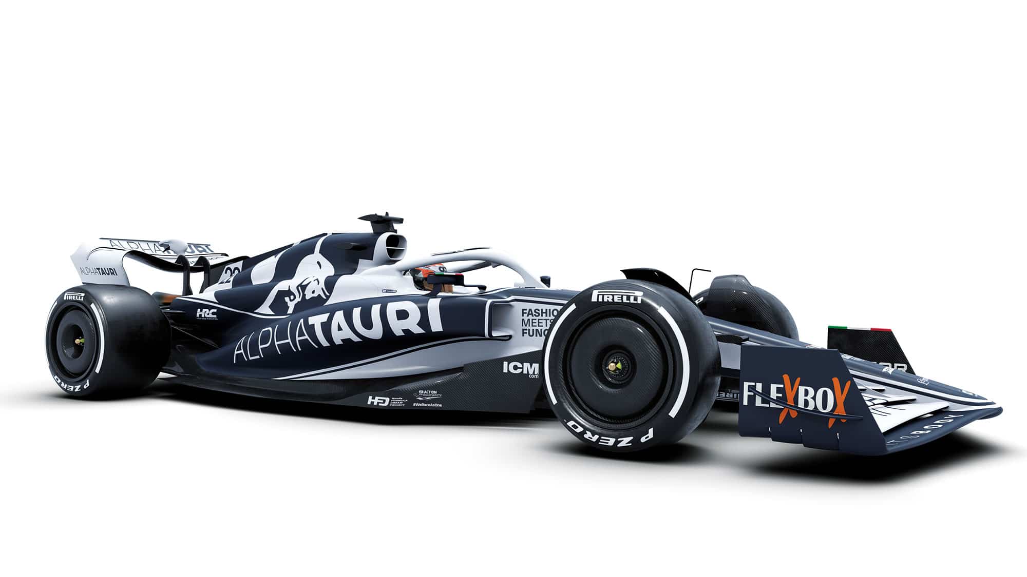
Shades of Brabham simplicity from AlphaTauri last season – and blue and white has impact on television.
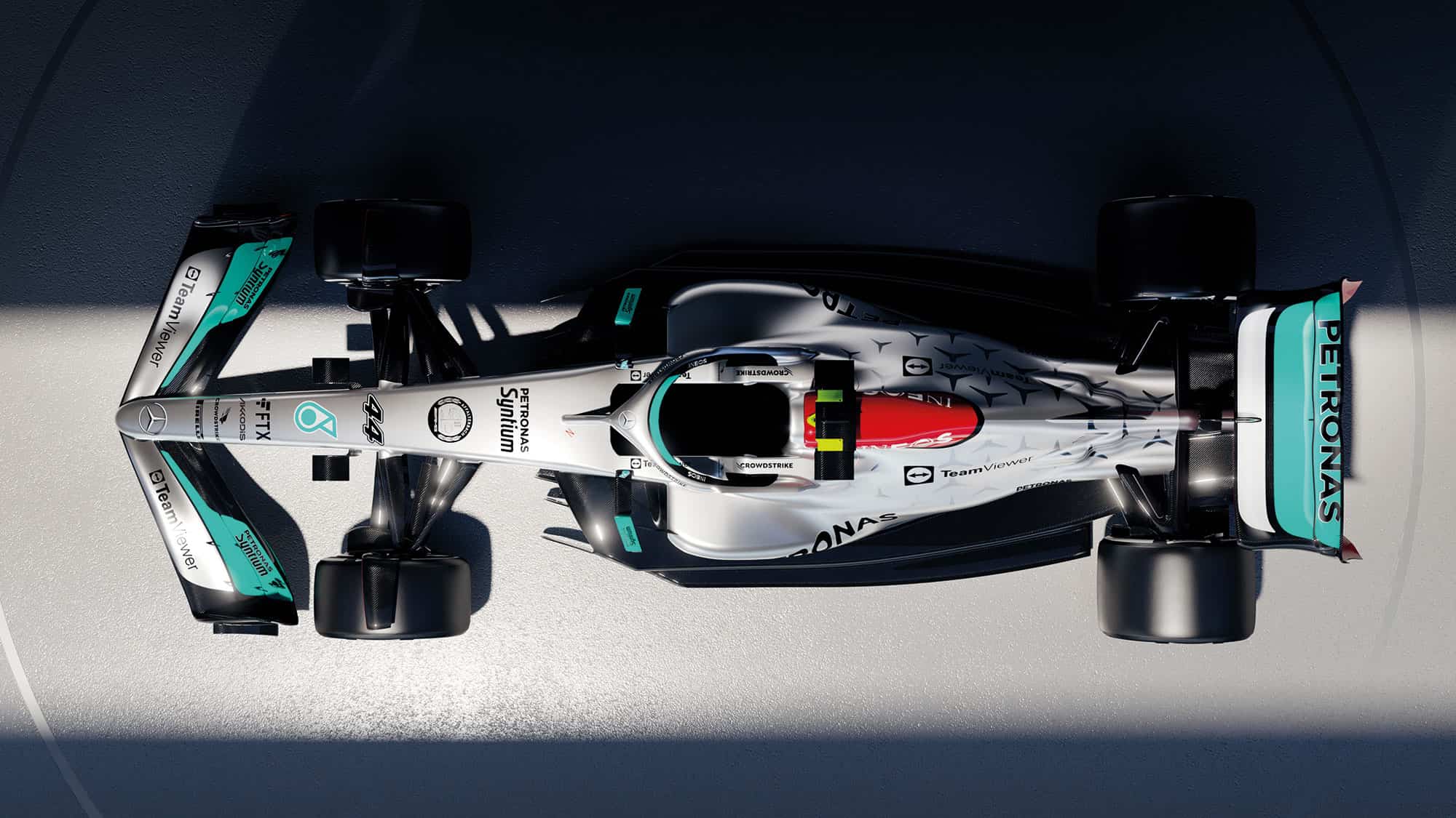
Mercedes’ livery is a fail for Stevens.
Mercedes
He doesn’t linger long on the modern liveries that don’t work, but calls out Mercedes-AMG for being “chaotic. I don’t know how that messaging works and those little stars, they just vanish completely from a distance. They are probably fun for someone. Then there’s the red of the Ineos flash. It’s sludgy.”
We dart next to one of Peter’s pet hates: the scattergun method to stickers on racing cars. Such a look was why David Richards brought him into Benetton during his single year at the helm in 1998, having replaced Flavio Briatore – who was busy counting the dollars of selling sponsor squares rather than concerning himself with the trivialities of aesthetics. Just look at a B197 versus a B198. Admittedly, the former was a quicker racing car that actually won a grand prix… but still. You’d think for a clothing brand, of all companies, presentation would be of primary importance. Stevens is scathing of the Briatore approach.
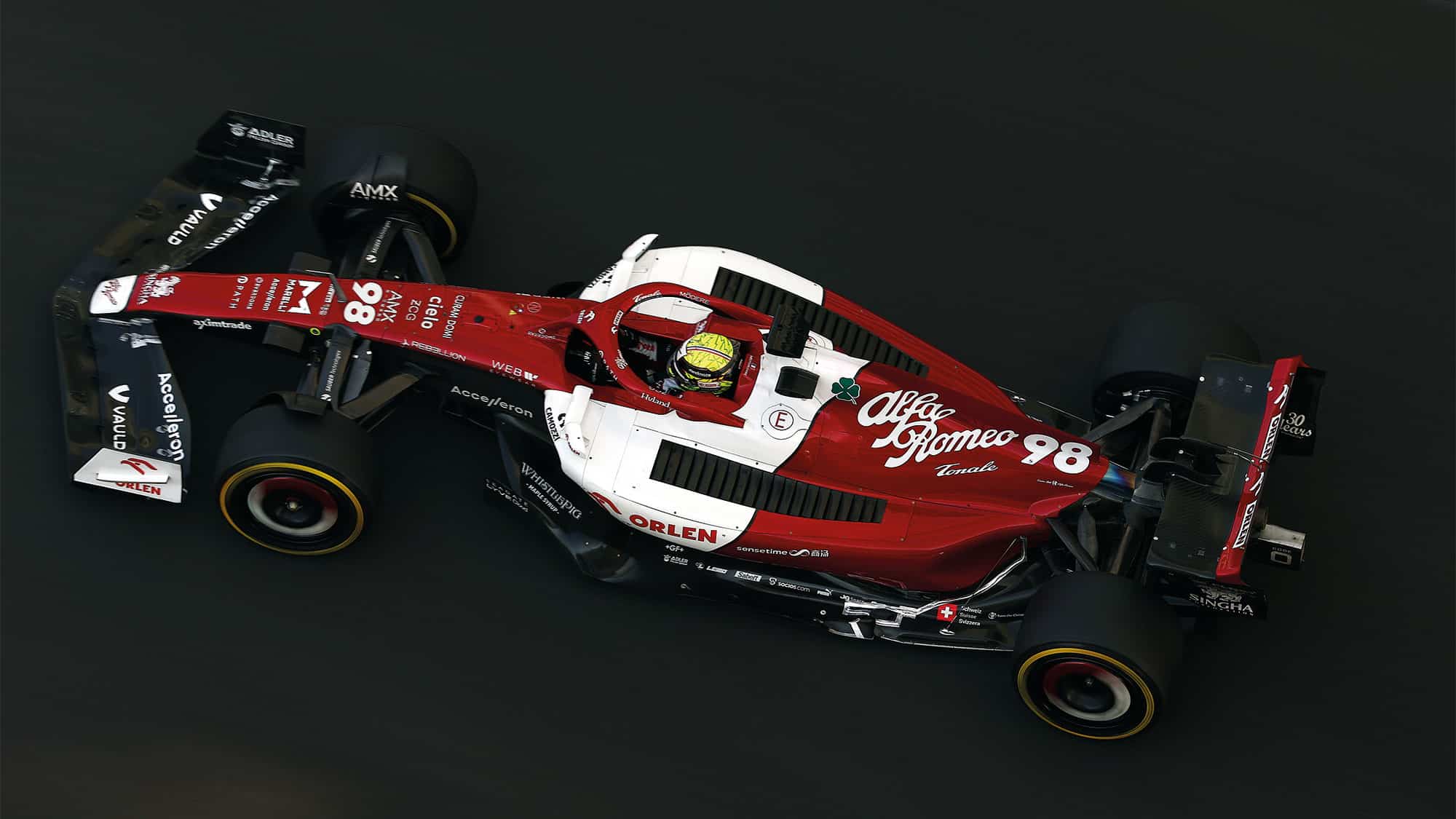
Alfa Romeo’s iconic colours are no more as Sauber make way for the future
Getty Images
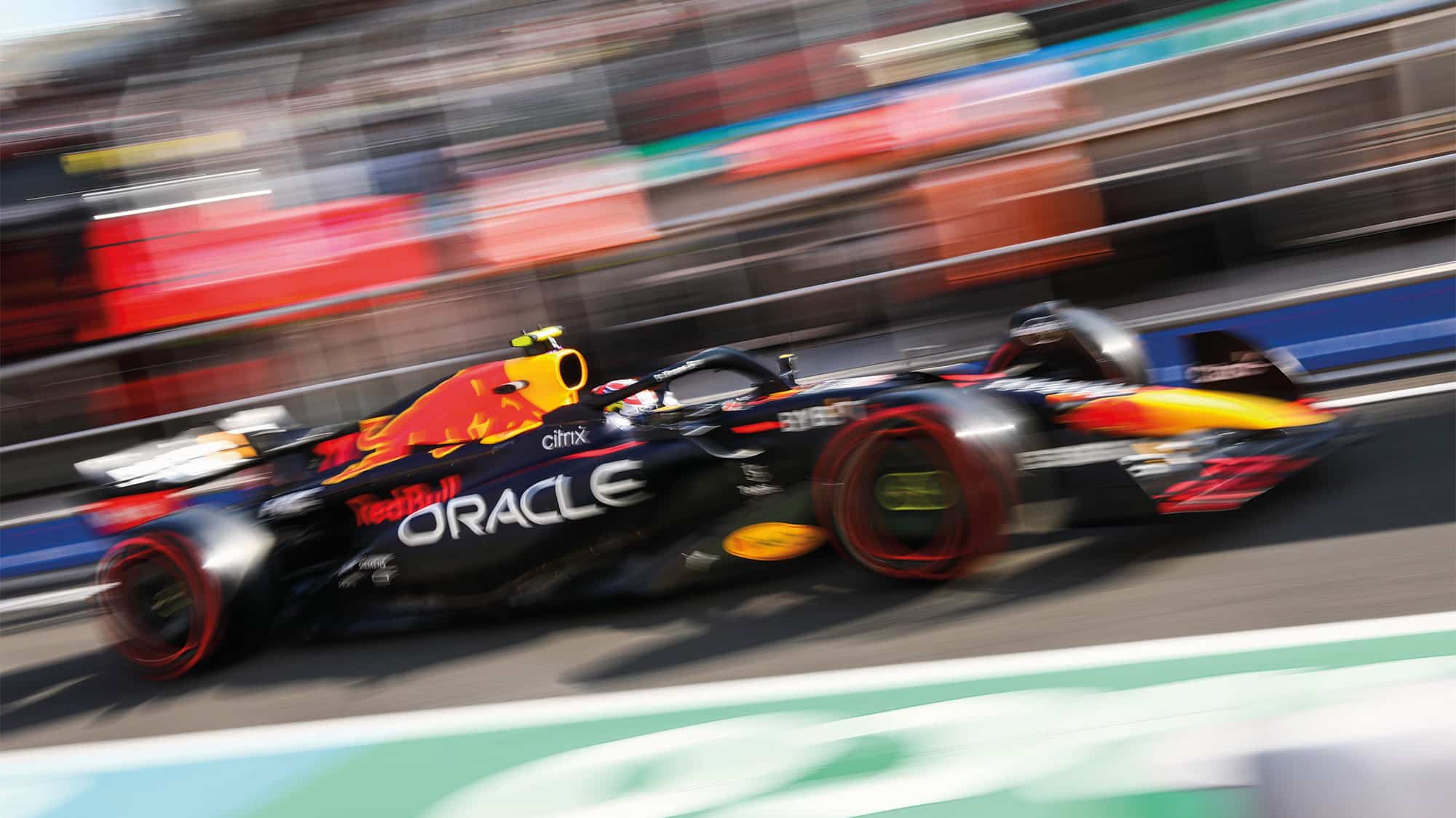
Yellow is always an attention-grabber on the grid, which Red Bull uses to its aesthetic advantage
Getty Images
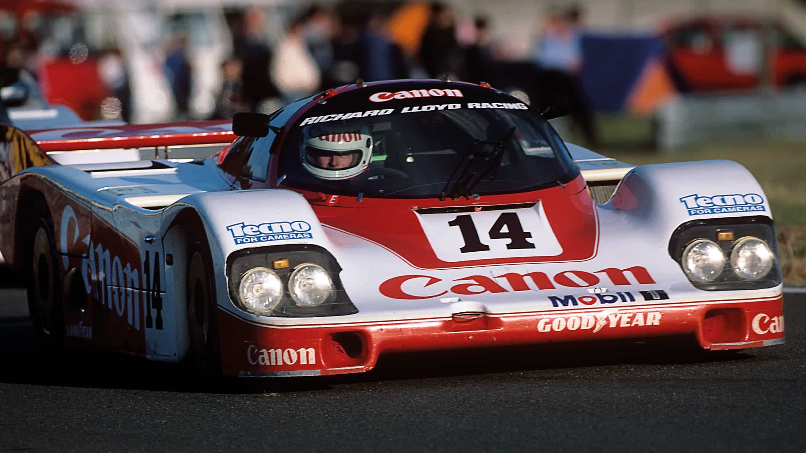
Stevens’ scheme for Richard Lloyd’s Porsche 956 in 1985 is a stone-cold classic
Getty Images
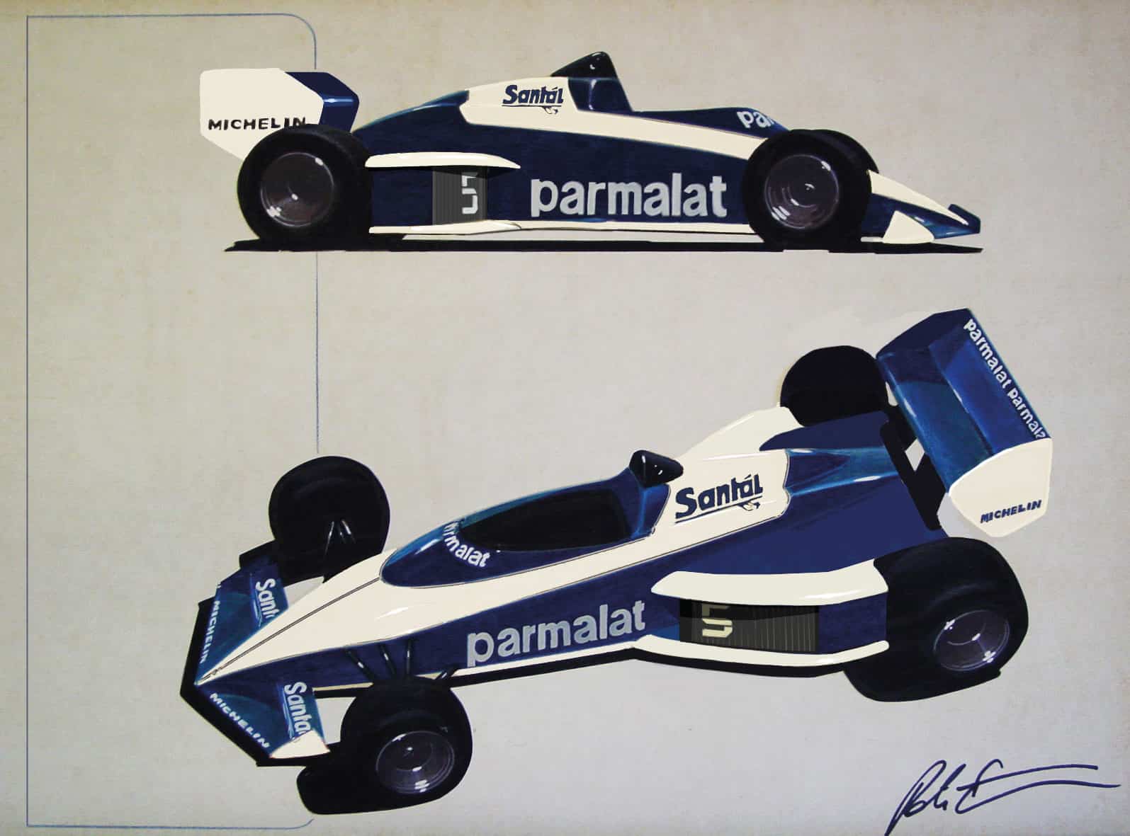
Artwork for the 1983 Brabham BT52, signed by the livery legend himself
“When David took over the car looked like a fairground ride,” he says. “It was awful and cheapened what they were doing. We were able to make the whole thing look more co-ordinated. Then again, we found there were stickers everywhere at Benetton, even in the lavatory. Messages from Flav: ‘Do not spend more than two minutes in the toilet’; ‘Wash your hands’; ‘Only use the amount of paper you need’.”
“Cheap stickers on the rear wing could upset aerodynamic performance”
What Stevens accepts is that F1 today is more complicated, in every area, than it used to be. He knows he wouldn’t get the freedom that he enjoyed under Ecclestone at Brabham. “People generally didn’t know what they wanted but Bernie was different,” he says. “He’d listen to a sensible argument. When Brabham started using aluminium for Gurney flaps I’d say to him everything aluminium should be anodised blue, including the beer barrels that you’ve got for pressurising the refuelling system. He just said, ‘Right, yeah, OK.’ He’d yell ‘Herbie!’ in the middle of the workshop. Then you’d hear Herbie [Blash] click, click, clicking down the corridor. ‘Everything aluminium has got to be blue anodised. Peter will tell you what.’ It would be that decisive. That’s why I enjoyed Brabham.”
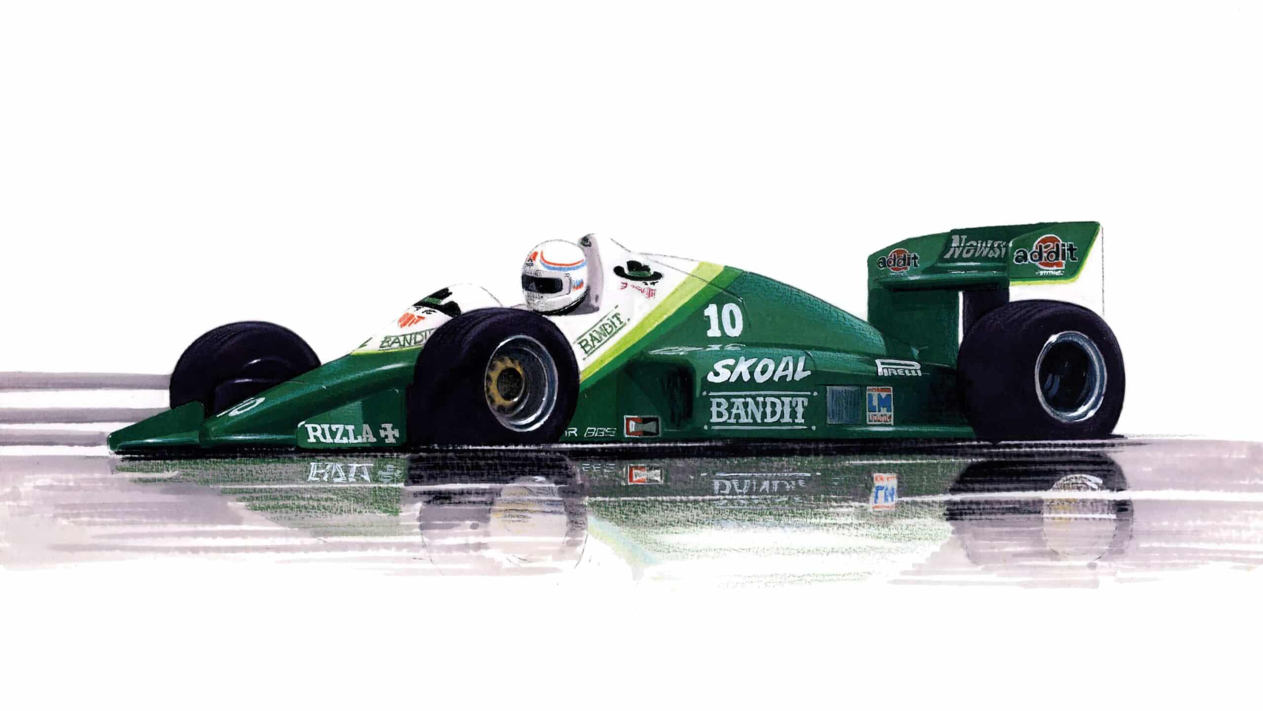
Stevens’ sketch for RAM’s Skoal Bandit livery for 1985.
Peter Stevens
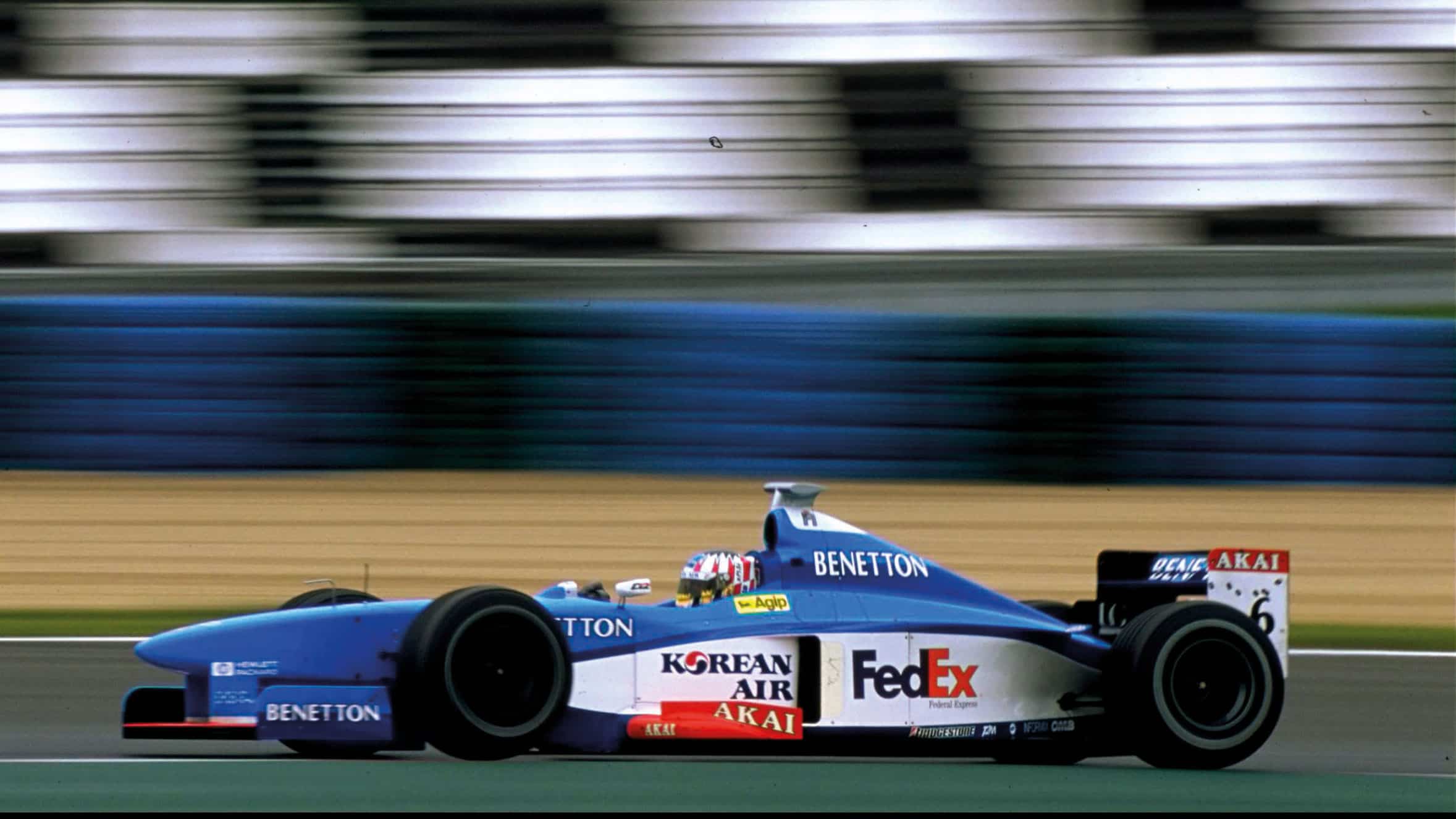
Stevens made improvements at Benetton the following year when David Richards
Stevens, was at the helm.
Peter Stevens
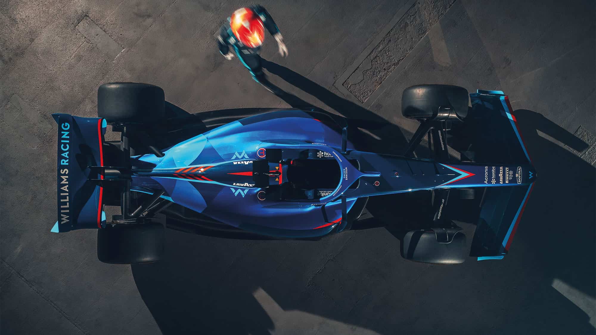
Williams’ new look for ’22
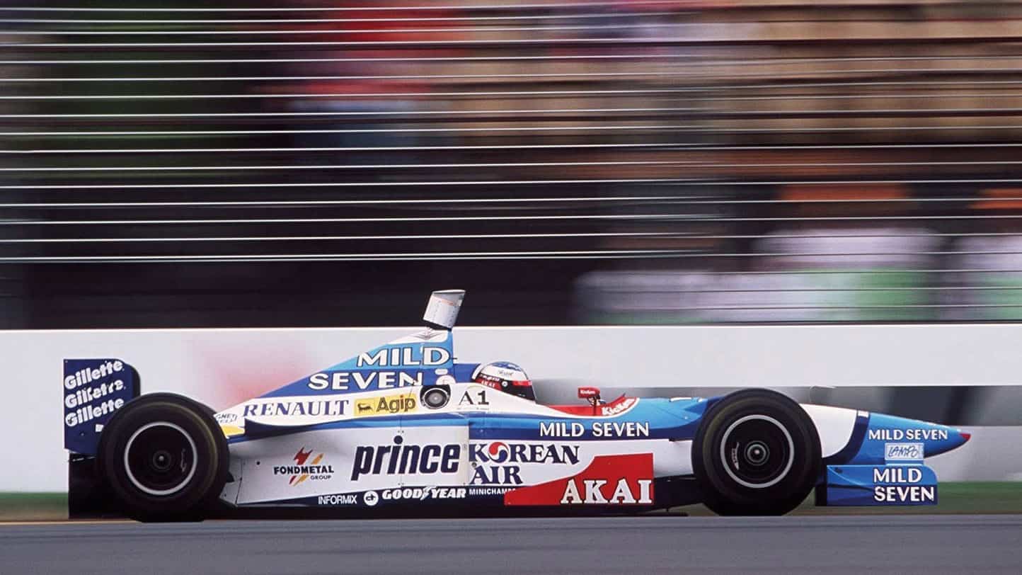
Scattergun on the 1997 Benetton – tsk!
A theme today is designers reining in marketing departments because weight saving is so crucial. Remember last year when the Williams launch livery lasted five minutes once the team started racing? But that’s not new, says Peter. “When I was working with Lotus we were using colour gel coat instead of paint. At Brabham too, which meant scribing the separation lines in reverse inside the moulds. It saved 9lb but Gordon [Murray] has no recollection of that! There was no doubt that cheap stickers for lettering on the rear wing could upset aerodynamic performance. I had a fellow who made these thin ones. Those things were properly important even then.”
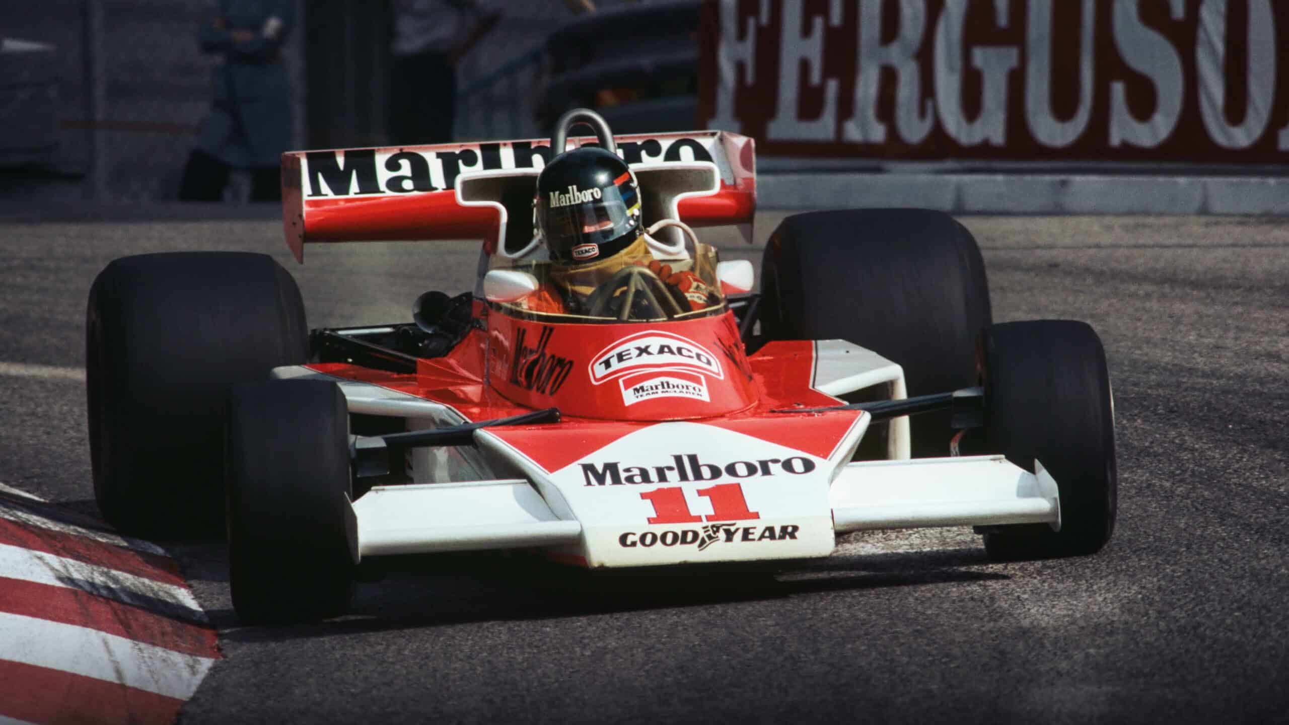
Formula 1’s most memorable livery with the greatest helmet scheme ever? James Hunt at the 1976 Monaco Grand Prix
Through the 1970s and ’80s, livery design became an art form as sponsors clamoured for attention. “I worked a lot with Guy Edwards, who was the master of organising sponsorship,” says Stevens. “He would have an enormous ring-binder file on each prospective client. Sometimes there would be three years of work in there before he would go to them with the scheme. Then look at Marlboro. They had such a nice, clear message. Smoking wasn’t a good idea but they had an identity and cared about the image of F1 because they wanted it to reflect well on their product.”
In other words, looks did matter, and they still do. Even if – or perhaps that should be especially if – your car is not the quickest on the grid. Just keep it simple.

